September 24, 2018
Lessons learned at TypeMedia
This July, I graduated from TypeMedia in the class of 2018. It was one of the most difficult, most rewarding experiences of my life. I’m still too close to it to understand its long-term impact on my design career, but I learned a tremendous amount and got to know a bunch of amazing people. Since the course, I’ve had an internship in St. Louis, moved back to NYC, and found a contract type design job for the next few months. I’ve also been working on a mini-website to show and explain my thesis project, Recursive Mono & Sans, which I’ll be posting publicly when it’s ready. In the coming months, I will also be working on my class’s collective website – a TypeMedia tradition which will be exciting to contribute to.
However, before I get too far into all of the next projects, I wanted to record a few thoughts about what I learned in TypeMedia. Hopefully, my experiences can somehow benefit the new and future students in the program.
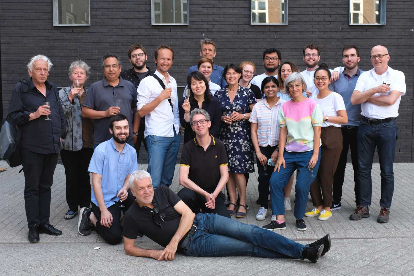
Above: my very tired class (the end of the year was intense) and most of the core instructors, celebrating the final day of the course
In this post, I will:
- Explain what TypeMedia is for those who don’t already know
- Give a few brief tips on getting accepted into the course
- Describe my two biggest worries before attending, and give my hindsight view of these
- Summarize the design lessons I learned and document a few of the practices I found useful in getting through the program successfully
- Offer a few general tips about life, finances, and admin in the Hague
First off: what is TypeMedia?
TypeMedia is a one-year masters program for type design in the Netherlands, at the Royal Academy of Art (KABK) in The Hague. It is a small class of about 10–12 students each year, with near-daily courses and critiques from professors who are some of the best type designers and type technologists alive today. This last bit isn’t an exaggeration. The teachers have made fonts used by huge companies and organizations from the NBA to IBM to the Dutch government to the Louvre Abu Dhabi. Several of the teachers have built software or Python libraries that nearly all type designers rely on today, to some degree or another in drawing and generating fonts. The alumni are just as impressive. KABK has a legacy of type education, but TypeMedia officially began in 2004. Since then, alumni have gone on to release typefaces through or work in many of the most important type foundries of today, start their own type foundries, marketplaces, and design studios, and create software widely used by a large portion of the industry today.
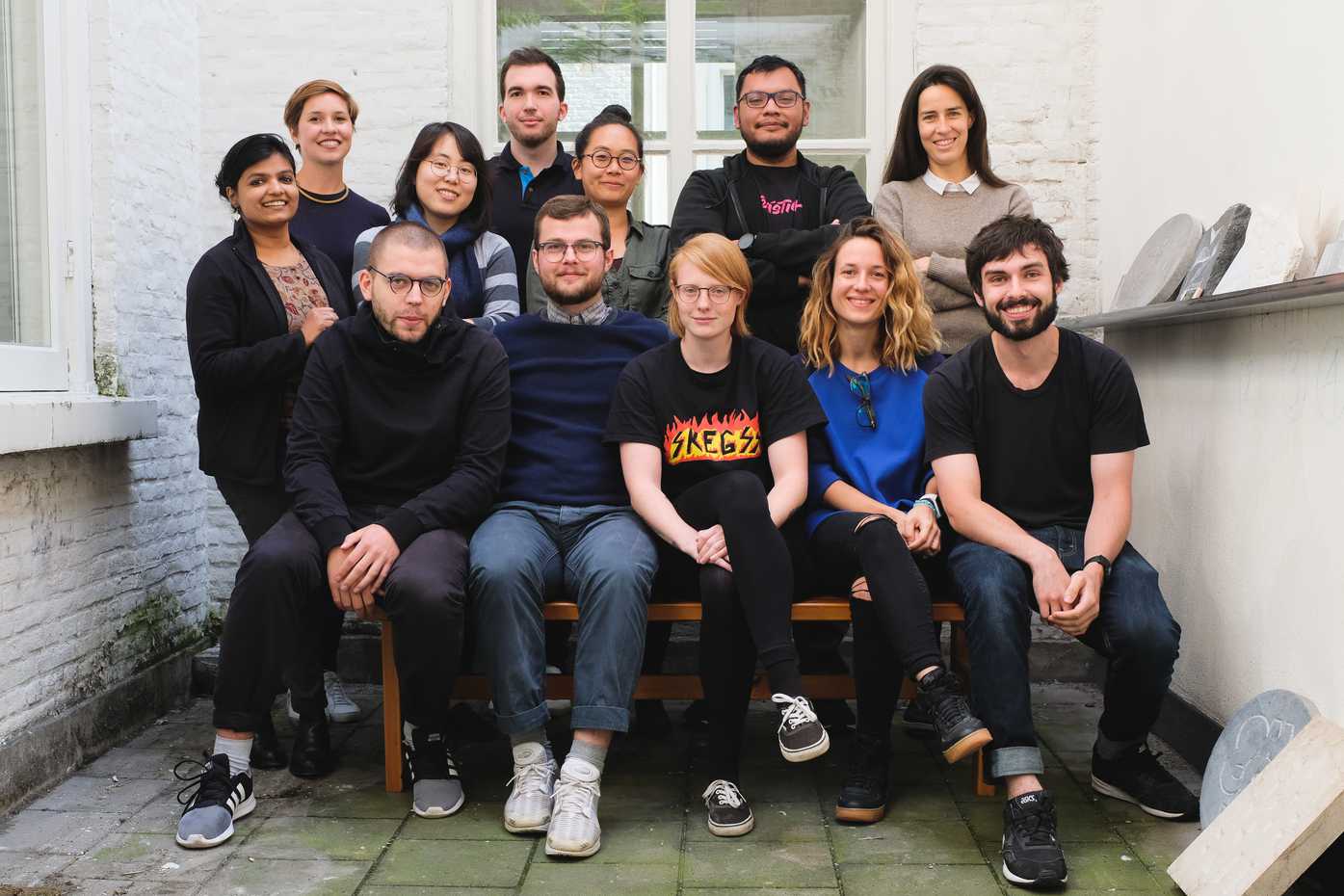
Above: my class at the start of the Fall semester (photo taken by Peter Biľak)
Like most specialty practices, type design may seem like a simple, small endeavor to outsiders, but it’s a vast field onto itself. Similar to music production, new software has made type design more and more accessible (and fun) for anyone to try. It’s gratifying to create your own letters to type with, so if you have any interest, you should give it a go! However, even though almost anyone can use software like Apple GarageBand to make their first song, it takes years of practice and learning to write, record, and produce a truly good album. Similarly, almost anyone can make their first font in software like Glyphs, but it is exponentially harder to build a typeface that is original, well-drawn, balances range & consistency, and works well across platforms.
Because TypeMedia is just one year, it operates on a very intensive schedule to fit in a broad range of lessons and scope of projects. In the first semester, we studied programming in Python, making type revivals from historical sources, creating original type families from brush calligraphy, stonecarving, studio practices, the details of complex interpolation (how intermediate styles can be generated from properly-drawn master fonts), designing for Arabic, Greek, and Cyrillic scripts, and more. In the second semester, each student had to propose an original type design project, then carry this out with frequent reviews and critiques from a core set of professors, plus visiting designers and designers at type conferences. With impressive and creative final projects dating back to 2004, there is significant pressure (not so much levied by teachers as by the students themselves) to make something even more ambitious than past projects. This thesis project makes the second semester even more intense than the first.
I first learned about TypeMedia on a college class visit to the Netherlands in 2013. At that point, I knew I was interested in type design, but I didn’t know there was a place to learn it from experts. Just like most graphic designers remember the first moment they realized their weird interest could be a college degree and a career, I think back to this class visit as the moment I discovered the specific type of design I wanted to do.
TypeMedia is very well-known in the set of designers who are typographically-minded, and even more so in the set of designers who are interested in making their own type. It’s one of just three full-time masters programs for type design in the world, and has a unique focus on the practice of type design, while the other master’s courses focus more on theory and history.
Getting In
TypeMedia is widely-known but maintains a very small class size. As a result, getting into TypeMedia is quite difficult. The teachers have a difficult task in selecting each class: a large part of what makes the program special is the students. Each year, the students are from many different countries and backgrounds (I had classmates from Spain, Germany, France, Croatia, Mexico, India, South Korea, Poland, and Denmark). These students must be competitive and gritty enough to complete all the work and be motivated by the work of those around them, but they must also be collaborative and kind enough to strengthen the group around them through 10 intensive months in a relatively small classroom.
I was accepted into the program on my second year of trying, like several of my classmates. I was fairly certain I would be beat out by some of the other amazing designers who were also applying. Some of those designers applied again the next year and have started this September. It would take a separate post to properly give tips on making it in, but the main things that matter are:
-
Create a portfolio that can be easily shared around a table of reviewers – most often, that means making a print portfolio, divided into multiple booklets, possibly (but not necessarily) with duplicates for the various reviewers. The idea of a print portfolio being useful today may seem outdated to some designers (myself included, on my first time applying). However, TypeMedia is a fully multi-media course. It would be nearly impossible to be successful in the course without a decent grasp of working with InDesign and print design, because you must make frequent type-proofing printouts and you are required to create multiple books, specimens, and posters for final projects.
-
Show up on the annual portfolio review and KABK open day in January. This allows you to present your work personally, and more importantly, it allows the teachers to gauge personality and compatibility of applicants through a personal interview. The teachers aren’t just selecting 12 impressive individuals – they are building a team which will spend the majority of 10 (sometimes stressful) months together. They need to make a team which will not only be productive separately but also a group of students that will learn from and teach one another.
I believe that one of the reasons I made it into the program was that I stressed that I would be excited and able to teach my classmates about foundational concepts in coding and technology, such as project versioning and collaboration via Git, and using web development as an additional design tool. Others got in because they were deeply knowledgeable about calligraphy, programming in Python, some area of graphic design, or already had a lot of experience in type design.
There are a couple of good blog posts that go into more depth in getting into TypeMedia:
- From Maria Doreuli: Example TypeMedia Application Portfolio
- From James Edmonson: So you want to apply to TypeMedia?
But what if it sucks? My main concerns before attending, and how things panned out.
I ended up reaching out to alumni with questions about TypeMedia at multiple points. If you’re reading this and it’s something you’re considering and have further questions about, feel free to get in touch with me via Twitter or Instagram!
While I was working on portfolio and application, two of my main questions about TypeMedia to alumni were:
-
Is it really worth it? Do you learn enough to be a professional type designer at the end, and are there enough opportunities in type design to give graduates a decent shot at a career?
-
Do people burn out on type design during the year? I knew I liked drawing type, but could I push Béziér curves around for ten months straight?
Is it really worth it?
I’ve only just graduated a couple of months ago, so I don’t have enough long-term hindsight to know if I’ll get a job as a type designer, if I’ll be able to sustain myself on freelance type and client work, or if I’ll be headed back into my previous field of software and web design (for the record: both would be exciting to me, and both would have their pros and cons for this stage of my life).
I am lucky to have had a one-month internship in St. Louis with Ben Kiel of XYZ Type, and I am about to start contract work for Google Fonts for a few months. I also have a couple of long-term opportunities to release TypeMedia projects through type foundries I greatly respect (these are just verbal offers, however, so I can’t publicly speak about them just yet or even be entirely sure that they’ll happen, and they would only pay a percentage of sales after release, so they will likely take years of #sidehustle to complete). What I can say is that the type designers I look up to were always kind and willing to talk with me, but it felt like I hit a switch when I could tell type people that I was in TypeMedia. It’s not just that it’s such an amazing program (though it is) – it’s more that it shows that I was willing to put my life on hold for a year to pursue type. Going through TypeMedia isn’t necessary for everyone who wants to pursue type design – it’s not possible for everyone, and many type designers I look up to have never been through TypeMedia – but it can be a helpful way to gain your footing in a complex field.
One thing that multiple alumni pointed out to me is that TypeMedia may be focused on type design, but it is by no means restricted to making type. In my experience, this turned out to be very true. I did spend many hours drawing type, but I also spent much of my time making scripts in Python to help manipulate or generate fonts, designing and making type-testing layouts for critiques, and writing and designing presentations, process documentation, and type specimens. That is to say, making type is only partly about drawing type, and just as much about testing ideas, using graphic design to communicate ideas, and if you’re up for it, coding your own tools.
So, even in the case that the next stage of my career is spent in activities outside of type design, TypeMedia gave my lessons and practice in being a more effective, thoughtful, collaborative, ambitious, and professional designer. Beyond all that, the year was a beautiful chance to gain friendships with designers from around the world and to experience life in the Netherlands – a much-needed break from the hectic life of New York which I am now returning to. I’m extremely grateful I had the chance to do it, and I would whole-heartedly recommend it to other type designers considering it.
And beyond all that, if you’re considering or about to start TypeMedia, you probably appreciate the magical feeling that you get from typing with your own letters. I got to spend ten months making type and experimenting with code, and I now get to use my own fonts in my day-to-day design work, like coding websites and writing this blog post. How cool is that? (If you don’t make type or if you’re not so woo-woo about it, you may ignore this justification).
Do people burn out?
Because TypeMedia is so varied, I never felt burned out in the way I worried I might be. Before attending, I wondered whether I might get to the point where, after drawing type for ten months straight, I simply wouldn’t want to draw anymore. However, as explained above, TypeMedia (and type design as a whole) is much, much more than just drawing type. I never did experience the ten months of Béziér-pushing I had worried about. For the most part, I felt motivated and excited each day, even though there were a few real crunches leading up to presentations.
People do burn out at TypeMedia, and by the very end, I partly did myself. The combination of being surrounded by competitive classmates and having teachers that openly expect remarkable results is a lot to handle. In the second semester, I deliberately took on a final project which I knew was ambitious enough that “finishing” it was an open risk. I wanted a broad variable font family, but what if working through technical hurdles would leave me with an unpresentable mess? In the final month, I chose to make changes that were extensive but felt necessary – in addition to creating the final exhibition poster, presentation, process book, and specimen. That final month is the closest I have come to “not sleeping” in favor of working, with two solid weeks of very short nights of sleep. I did accomplish a lot in that time, but on the day of final presentations, I had the feeling that if the same intensity were to continue for another week, I would just … stop functioning. Whether I could have kept working beyond that is an open question, but I certainly was forced to confront my limits of emotional and digital output.
Luckily, I have since had the chance to take some vacation, move back to the US, and learn at an internship that was more about coding and exploratory drawing than obsessive focus on a single typeface. I’ve gotten to spend more time thinking, writing, and doing web coding. These things have helped clear my head a bit and have made me eager to get back to more type design.
Concrete lessons & tips
Now that I’ve finally provided some context for this post, here are a few of the top lessons I left TypeMedia with. A few of them are good design lessons I’ll carry on, and most are specific things that helped me through the year or things I wish I would have done better. As such, the following section is written to anyone currently starting a year of TypeMedia, though I believe that these lessons apply to just about anyone working in a design team or working on a big project.
Be enthusiastic and learn everything you can
In general, I think that approaching most topics with curiosity and enthusiasm is the best way to learn and to have a good time. I know this can be hard sometimes, especially if you feel busy or pressured by multiple projects. However, in a course like TypeMedia – which mixes many disciplines, classes, teachers, and approaches to teaching – it makes a huge difference to attend classes with an open mind and a gung-ho attitude. Every one of the teachers has done great work, and you can learn valuable things from each of them. A few of them give more assignments or teach in a more unconventional, less-direct way. Treat the assignments less as “homework” and more as opportunities to learn, and ask lots of questions to get what you want out of unconventional lessons. My classmates all did beautiful work and got a lot out of the course, but those who kept an optimistic perspective seemed to have about 50% more fun.
Enjoy your classmates. They’re amazing!
Your friendships and peaceful coexistence with them will be your primary source of happiness and stability while you’re in the program, even if you keep in close contact with people back home. Some of your classmates may have a few tendencies which may irritate you, but be forgiving, because you probably annoy others, too. :) Your classmates are nerdy and driven enough to also be at TypeMedia, so they’re wonderful people who are worth being friends with and learning from. If you get into a disagreement, be willing to apologize quickly and get on with life.
The best moments in the course weren’t presenting work or finishing assignments – they were having meals and conversations with my classmates. Be sure to make time for those ceremonies!
Try to have good posture. Stand up when you can.
By the end of the year, my back was really achy from sitting at a desk for so many hours a day, likely with terrible posture. Do what you can to avoid that: sit straight, try to find a way to stand while working, get up and walk around enough, and (as my dad tells me) do more yoga.
Don’t get stuck on debugging a specific piece of code for too long. Ask questions!
At TypeMedia, you are surrounded by type programming experts. Yes, you should Google a bit and try to work through code challenges. However, if you get stuck on some bit of Python, ask for help instead of wasting hours on something that might be small. A shocking amount of the time, you’ll figure out the problem by just writing out a clear description of your issue.
Of course, even if you’re not at TypeMedia, there are plenty of smart people willing to help you online, if you ask in the right places. You shouldn’t ask questions before you try to solve things by yourself, but good designers and developers aren’t afraid to ask questions when they need to.
Don’t get stuck on idea generation.
The second semester comes quickly, and then it goes fast. Try to come up with a few good ideas for your thesis project in the first semester and over winter break. Test these as early and as quickly as possible so you can start the second semester with at least three ideas you are excited about. We presented each month of the spring semester, starting on February 15th. Everyone showed a few ideas in the first presentation. Some students kept generating ideas and deciding what the project should be. Other students decided in the days after that and had started to develop it by the second presentation. That gave them an extra month to work on their project – a very significant advantage when there were just four months to develop large and complex projects.
Despite its many constraints, type design has infinite possibilities. That can feel paralyzing at times because it’s not always possible to devise a logical argument for one solution over another. Still, take each decision as a design process: generate multiple ideas, test them in context, and ask for feedback when you can. Go with what seems best, but keep copies of your work as you go, in case you need to backtrack.
Make models.
Petr van Blokland will hammer this lesson home in his class sessions, but at each step of your design process, you should strive to have a “model” of the overall object – something you can show someone else to explain what you’re doing.
Petr uses the example of an architect building a house. Instead of telling their clients to “relax and expect great things in a few months,” the architect will show a physical or virtual model of the project design. That way, a sink can be moved without ripping out the whole kitchen.
In terms of a typeface, making models means different things at different stages in the process. When you’re in the first hours of exploring what a type family should be, that might mean drawing a few test characters (e.g. Hamburgerfonts, or my preferred alternative, Newfishtacoburg). You can also test your overall design space ideas by making just one letter (e.g. a in Thin, Regular, Heavy, and then interpolating these styles to test how your idea works as a system). A few days or weeks in, that probably means having a full lowercase set in at least the regular weight, so you can begin setting running text in realistic-looking typographic layouts to judge the font by reading it.
It’s as much about getting critique as making letters. Be quick and flexible, not perfect.
One of the things that makes TypeMedia so intense is a schedule of near-daily critiques with different professors. It is difficult to make all the corrections suggested by each professor in time for the next day’s critique, or sometimes even for the next week’s visit with that professor.
One thing that slowed me down was my over-optimizing for testing my typeface with a custom website. This gave me a chance to develop my abilities further to work on web code, and it also allowed me to create templates which were in theory more efficient to update with new fonts or extend with new layouts. However, it simply tends to be difficult to have a proper discussion about type on a screen, in a web browser. Paper printouts are more effective almost every time. As a significant benefit, print tests can be very quickly thrown together either to ask for specific feedback (“How are these accented characters working together?”) or to provide a general example of the look and feel of a typeface (“Here’s my typeface in an example magazine layout”). On the web – even if you’re a good developer – you will almost inevitably get sucked into rabbit holes like accounting for CSS quirks or fixing unexpected workflow issues.
Use each medium for its strength.
Given more time to iterate web tests and more time to refine test layout formats, I do believe the web can be a powerful tool for type proofing. However, in terms of a TypeMedia project, you will hardly have enough time to develop your understanding of how to best test typefaces, and how to best test your specific typeface. Work in desktop design tools while you are figuring out what to test, then bring your ideas into code when you find that you’re repeating yourself a lot.
Meanwhile, I find Drawbot to combine many of the useful aspects of coding your tests (efficiency in creating variations or making complex systems which would otherwise take repetitive work) with the benefits of print design (the ease and speed of making simple tests focused on specific questions). Some of my classmates used Drawbot to great effect in making animated tests and demonstrations of their Variable Fonts, which is something I should have done sooner, but instead mostly did after the program.
In the future, I will also consider taking some lessons from how I tend to work in Drawbot and using them as a “wrong” but useful approach to web proofing. I will try to design things that are contained to a specific question, and not overly-optimized (e.g., they may not be responsive if that isn’t the question I’m seeking to address).
Meet with visitors as soon as you can.
Robothon is a triennial font technology conference held by TypeMedia, which luckily coincided with my class year. During Robothon, there were many incredibly knowledgeable type designers visiting. Even though my project was at an extremely early state (and embarrassingly drawn), I showed it to several visiting designers, and I asked them questions on my mind. I got extremely useful feedback and advice which drove my project in several ways. I was able to do this because I didn’t wait until the end, but rather started asking for feedback from the first coffee break on Day 1 of the conference. This was not very chill of me, but I was kind and polite about it, and most people responded well to my enthusiasm.
By contrast, we had a very experienced type designer visit when we were about 2/3 of the way through the second semester. He was in the classroom for two whole days, giving individual critiques. I really wanted to get the best possible feedback, and I also wanted to make a good impression, so I felt a need to work through a backlog of corrections and set up my web testing site properly to show this designer my project. To give myself extra time, I took the last slot for critique, on Day 2 of the visit. Unfortunately, we all but ran out of time, and I barely got in ten minutes of time with a visibly fatigued reviewer. Many of my classmates were more eager and available for critique sooner, and they were able to get in maybe 45 minutes of time with a more-alert reviewer on Day 1. In some cases, these classmates were even able to check back in with further corrections and questions on Day 2. Their openness and energy gave them a better set of feedback to move forward with, and it also happened to make a better impression.
The reviewing type designer was generous enough to give me the chance to have a follow-up email critique – which I gladly took up and worked hard to make the best of – but they were back to work and not able to offer quite the same level of advice.
As Benjamin Franklin famously said, “The early bird gets the better design critique.” (I may be paraphrasing that slightly).
The spacing and kerning could always be better
I think it was the TypeMedia teacher Paul van der Laan who said, “a well-spaced, poorly-drawn typeface is much better than a well-drawn, poorly-spaced typeface.”
If anyone is reading who doesn’t work with type much (thanks!), spacing is the general amount of spacing between glyphs, which should be optically similar to promote a steady reading rhythm, while kerning is the set of exceptions inserted into the typeface to improve spacing between specific glyphs like “AV” or “Yo” which would otherwise have overly-large gaps between them.
Before TypeMedia, I did think about spacing and kerning in fonts and logos, but I also sometimes felt that type designers were a bit over-zealous about the importance of these factors. Now, I can’t look at a poorly-spaced piece of lettering or typography without wanting to fix it.
Don’t expect to finish your projects during the school year.
I wanted to release a beta version of my thesis project before graduation. That wasn’t possible, and trying to complete my entire typeface made it much harder for me to present a stable version of my project in the end.
If you can release your font inside the year, you probably haven’t been ambitious enough about the scope or quality of it.
At graduation, you’ll be showing a prototype of a typeface. Plan accordingly.
A good strategy: work on a single “core” font, with partial extensions.
One strategy that many of my classmates took for their thesis was focussing on pushing a “regular” weight of their typeface to near-completion, then building a small character set in the stylistic extensions of their type family. This allowed them to typeset their process book, poster, specimen, and final presentation in their typeface, and to make useful diagrams to show their broader structure of the family. Focussing on a regular weight and being more loose about other styles allowed them to better show how the type family would extend as a multi-lingual tool, but also to better present the system in animations, imagery, and example use cases.
Variable fonts have some issues right now.
A big goal of mine at TypeMedia was getting to be more familiar with making and pushing forward the development of variable font. For any readers that may not already know about variable fonts, they are fonts that contain multiple weights or styles in a single file, allowing the end user to select the precise weight they want, rather than having a bunch of separate files with only those few exact stylistic options. This is more efficient to serve over the web and allows exciting possibilities like fluid transitions between styles.
Making a variable font was a fun pursuit for me, and it gave me a perfect central focus for my final project. In the end, I found it super rewarding. However, it took more time than I had expected to wrestle with unexpected export issues, and it has been harder than expected to use variable fonts in web browsers to do things like animation. I’ll have to make a separate post to try to document this process in a digestible way, but know that if you are set on making a variable font (or if you plan to work with any other new technology), you’ll probably have some issues to work through.
Keep yourself happy & healthy.
I found out again how much I enjoy running outside. The Haagse Bos (Hague’s Woods) are a huge park right next to KABK. They are lovely to walk in with classmates, and maybe even better to explore on your own while jogging.
I barely made it to the beach, which is nuts. It is gorgeous, and I was an easy 20-minute tram or bike ride away! It’s a busy year so you’ll get caught up in work, but make sure to visit for at least a few sunsets.
There is usually a tool to make your work better – find it or make it.
One of the best parts of TypeMedia is that it puts a big emphasis on finding or making new tools to help automate and improve design work. Many of these tools are already made, from “simple” Robofont extensions like Nina Stössinger’s excellent Word-o-Mat to more complex extensions like Tal Lemming’s essential Metrics Machine.
Many, many smaller tasks can be best done using Python scripting. Need to transform a bunch of glyphs? Use Python. Need to edit the info in a bunch of font files? Use Python. Need to check anchors for consistency, or rename glyphs, or output slanted starter italic fonts? Use Python. I wrote a bunch of scripts throughout the year, and I put the ones I used most often in a public GitHub repo. Obviously, I can’t guarantee that they will work perfectly, but they give an indication of a few useful techniques and may point you towards some things worth trying yourself.
Finally, if you’re in TypeMedia, you’ll be writing a ton. Consider using Grammarly to give your words an extra pair of robot eyes. I catch an amazing amount of typos and poorly written sentences with this tool. (They don’t have a referral program so I don’t gain anything from you signing up, but your writing will be better!)
Keep backups! Use Git if you can.
In March, after I tried to recklessly install a few too many Python packages without using virtual environments, my computer starting shutting down randomly and more-and-more frequently. My most important data was backed up on Dropbox, and my type and code projects were all pushed to GitHub. Still, I was lucky my computer didn’t crash completely, all-at-once. I was able to get a couple of hard drives and do a factory reset, and things have been working fine since then.
At another point, I was working on my final project and managed to accidentally delete a whole lowercase set from one of my master files. This may have been due to a mistake in scripting, or it may have just been a mistake caused by working at night. Normally, this kind of mistake would potentially mean hours of lost time. Luckily, I was covered: I was able to revert my project back to a Git commit from just before my error, and it was as though there was never any mistake. Especially if you’re scripting, be sure to use Git to commit your project before you make changes (or at the very least, make backup copies of the font files on your computer).
Finish strong (start with your final presentation, then make the process book)
To graduate, we had to present our final projects in the following ways:
- Process documentation, detailing what we made and how we made it, in the form of a printed-and-bound book (at least two copies)
- A type specimen, advertising the type project as we might in the style of booklets or materials to hand out at a conference (at least 16 copies)
- A large-format poster, showing the typeface in a way that would work well in the final KABK exhibition (85cm by 360cm?)
- A 10-minute presentation, explaining to teachers, classmates, and guest reviewers what we made and how we made it
- As a bonus, I also wanted to build a web specimen, but I ran out of time with all the other materials. Instead, I created just the “type tester” portion as a “minimum viable product” that could be on a laptop in the exhibition space for our graduation show.
I approached these materials roughly in the order of the bullet points above. In hindsight, I realized that this probably was not the most effective way to order them.
I spent most of my time writing and designing the process book during a very intensive week-and-a-half. In the end, this book had about 15,000 words, which meant that of course, I wrote well over that amount and edited down in refining and designing the text with images and layout. This approach had four primary problems:
- I didn’t have as many images as I would have liked.
- Though I tried to write for a general audience, I’m not confident that I did an outstanding job of it. I probably could have ordered things more sensibly and described a few things more clearly.
- When it came time to make the presentation, I was much more confused than I thought I would be about what to say and what to include. I felt that writing my process first would make the story clear, but I found that I had far too much content – and too few supporting images – to make the presentation I would have wanted to make.
- I ended up not having time to sufficiently detail some of the parts of my process. Probably my most significant omission was forgetting to include that my incredible classmate, [Rafał Buchner], created two RoboFont scripts that were extremely helpful in my process. Likely, though, more people will read this blog post than the process book, and hopefully, that makes up for it.
If I were to repeat the semester, I would likely do my best to make the presentation first, focussing on creating imagery that might also be incorporated into the specimen and poster. Once I had most of those materials clear, the process book would (I think) be faster to write, and a better explanation of the project that could a. Record the presentation, plus b. Fill in any gaps that wouldn’t fit into the 10 minutes of speaking. I wrote notes throughout the semester, but these were more helpful in my day-to-day design process than as a real reference in writing the final process book. I suspect that these may also be helpful if I need to get into the mind-space of my design decisions in the future.
A few other practical matters…
- Try the HEMA breakfast with a classmate. It’s fun, cheap, and tasty. You get 5 items for 2 Euro. Fair warning: they do count everything as an item – including the little single-serving butter – so get some eggs and cappuccino before you opt for condiments.
- Recycling is a bit hard. The Hague does recycle glass, paper, plastic, aluminum, and drink cartons, but you need to find the right drop-off containers, which is harder than it should be. I lived close to the center of town, and right near my house there were containers for glass and paper at Bocht van Guinea 25. Shamefully, it took me until my last days in the Netherlands to finally find that there were containers for plastics and drink cartons within a short walk, at Paviljoensgracht 41.
- If you use something almost every day in your life before TypeMedia, you’ll probably miss it if you don’t bring it in favor of packing light. I particularly missed my travel coffee mug (surprise: my coffee addiction persisted in The Hague). I also really missed my oblique pen holder for pointed-pen writing (surprise: there is a fair bit of time for letting and calligraphy in the course). On the other hand, I also brought a musical instrument which I barely found time for, and I should have instead replaced it with more of my art and lettering supplies. Packing can be hard to get right!
- I tried to budget for the program beforehand, and it was challenging to know how much art supplies and printing would cost. I wanted to keep track in a spreadsheet, but this was difficult to keep up with the many unplanned or incidental costs. I got an estimate from a former student that it there was maybe 50€ per semester in supply and printing costs. I would estimate that it was closer to 150–200€ per semester, and possibly more. This was partly because I should have brought a few more things from home, and partly because KABK has incredible, very affordable workshops for printing and making things. I particularly fell in love with riso printing, though there were also options for screenprinting, laser cutting, 3D printing, metalwork, and more. 200€ is spendy, but I found it useful to remember that KABK is a fraction of the cost of American and English universities.
- When you’ve graduated and it’s time to return home, close out your bank account and phone account while you’re still in the Netherlands. Otherwise, you’ll end up puzzling your way through customer service helplines on Google Voice at $0.19/minute. (If you do end up on Dutch customer service phone lines, I’ve found that mashing the number keys is the surest way to get through to a person, and they have always spoken near-perfect English).
To this year’s class: enjoy!
A new year of TypeMedia has just started. To all those students: enjoy the next 9 months! It’ll go fast, so savor it. I can’t wait to see what you make!
If you have any questions about the course, have an issue in Python, need another pair of eyes on some type, or want to talk, feel free to reach out to me! I may or may not be able to give you the exact right answer, but I’ve received a ton of help and advice from others, and I’m happy to pay it forward as well as I can.
Photo credit to Ryan Bugden (here’s the original tweet, including an improved GIF version)